|
| This is so far my preference and this is called the strongest amongst those I have asked for feedback . |


|
| This is so far my preference and this is called the strongest amongst those I have asked for feedback . |
 |
| I rather like this as it clear, concise, clean and still intricate with many layers of shades. |


 |
| This is initially the kind of design i had stuck with, until my tutor preferred other designs so it led me to experimenting a lot more. Although this is still one of my favorite designs. |


 |
| I like this but the slant on the text is too much. |


 |
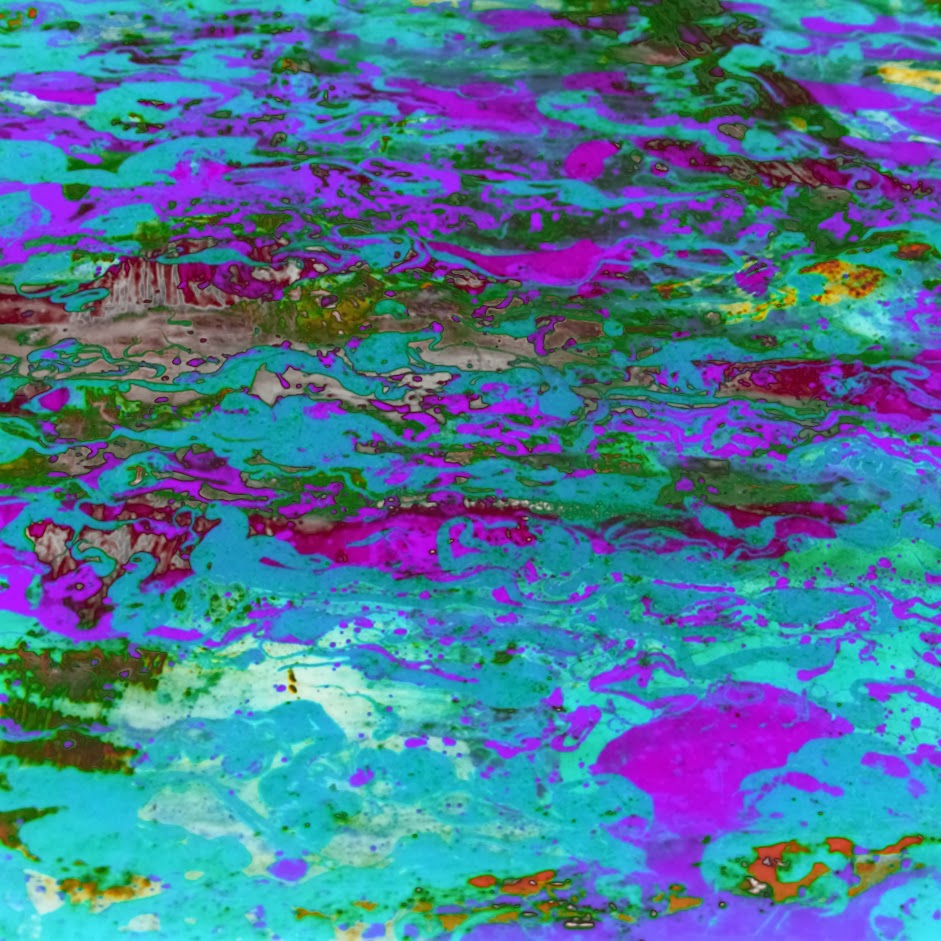
| This is in my opinion one of the strongest, it is very eye catching and interesting and utilizes an artistic approach, drawing on psychedelic themes whilst staying away from look tacky. I think the target demographic would be interested by the album because of how it stands out. |